
Context
Moneybox is a maturing FinTech startup offering users a simple way to get into investing. They began with the round-up feature, a simple hook to allow users to round up their spare change to invest.
Since joining, I have been involved in several significant product releases that have propelled us to over 300,000 users. We no longer just offer investment products to our users, in this year alone we have launched our first-ever Cash LISA, Savings and Pensions accounts. With the breadth of growing products in place and our growing userbase, we saw the perfect opportunity to update the brand.
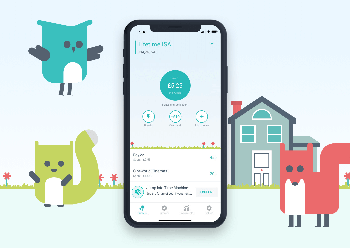
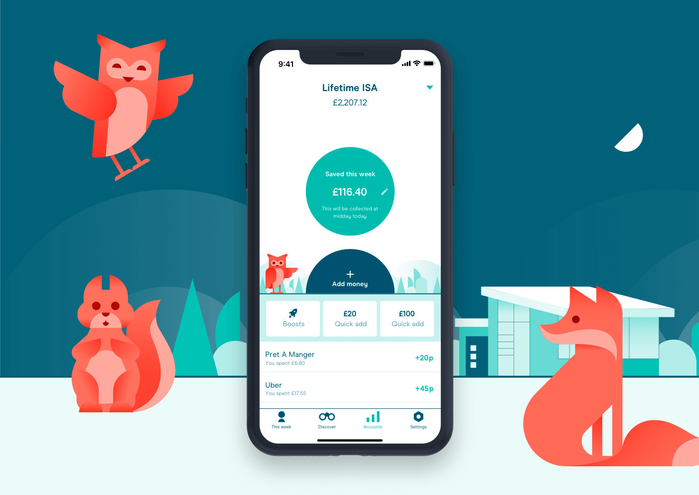
👇 Use the slider below to swipe between the new and old branding.
Kick-off
I was involved in the first meeting to plan the approach and execution of the rebranding project. We sat down with an external branding consultancy on multiple occasions working to define potential routes we could take. After many workshops and iterations, an initial style guide was born. Bringing with it an entirely new fresh look we all liked and resonated with. We enlisted the help of two contractors, Jenny and Nicola, who helped us in redesigning hundreds and hundreds of screens (Over 500! in total).
Ben, our former Head of Design, created a spreadsheet outlining all of our current app screens. This allowed us to track our progress and delegate different sections of the app to a designer. After Ben departed the company, I took over the responsibility of representing design at company-wide updates, growth meetings and sessions focussed around the rebrand. Working with Jack, the other designer in the team, we managed the work of the contractors and ensured that the teams' progress was well communicated and blockers were flagged early.
Design
I owned the design and deliverables of the following:
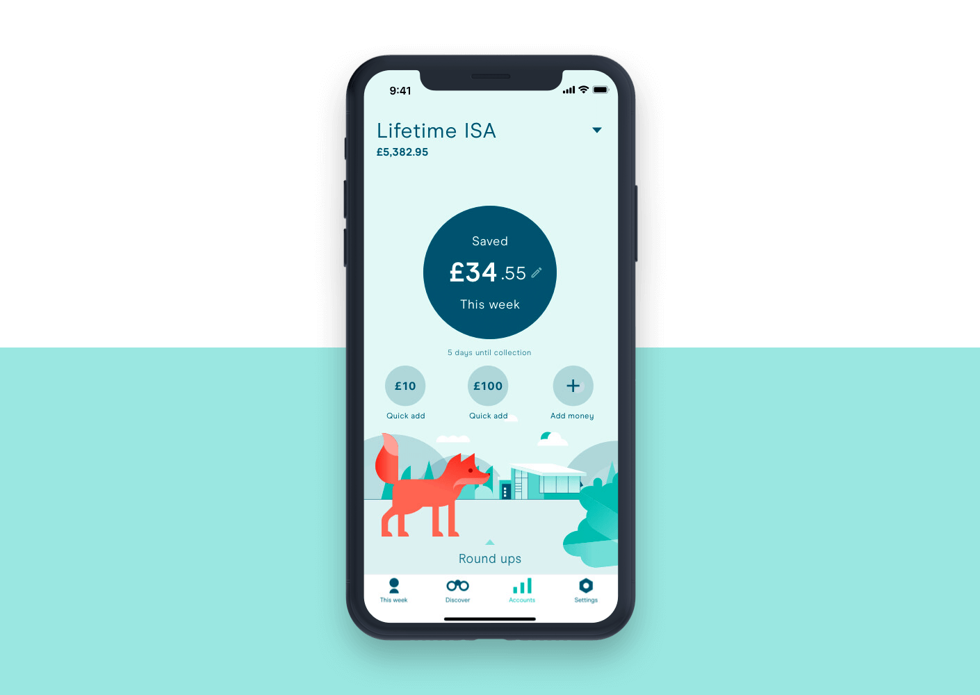
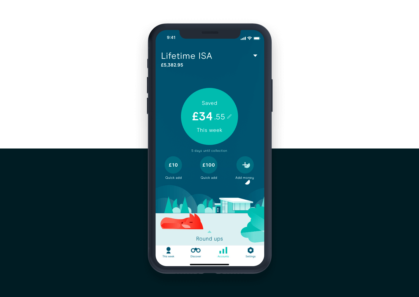
For this case study, I'll be focusing mainly on the first section I worked on for the rebrand — the 'This Week' tab. This section is essentially the home screen for the user. Nailing the design for this section was critical to get right. This tab would introduce our new customers to the core app, displaying multiple functions from rounding up their spare change and contributing funds to switching across different accounts.
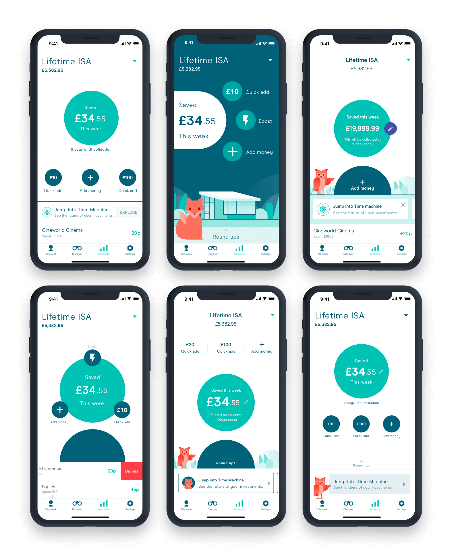
I initially took to developing several varying designs, ideating, sketching and generally spitballing designs to gather regular feedback quickly. My first approach to the screen was to start with a basic rehash of the current design by simply updating the fonts, colours and spacing. From there, I used this as the fundamental benchmark to build upon. Each iteration would push the boundaries introducing new and different elements taken from the new brand style. You can see further explorations below, this particular concept shows how the scene would react in light and dark mode.
We held daily review meetings with our CTO and the product & design teams. Aside from stand-ups and meetings, I kept in regular communication with the developers throughout the design phase. I would regularly share my design concepts and ideas via slack. The gathering of valuable feedback via conversations and review sessions helped me to define the conclusive screens for the This Week Tab and the various sections of the app.
Product review
To test our app internally, we used a software called HockeyApp. This allowed us to review builds on our devices in an isolated environment. JIRA was used to track the progress of tasks and bugs via a kanban board. Developers would progress their tickets into product review once they had finished working on it. It was my responsibility to review builds in IOS while Jack managed android. We both worked extremely closely with the development and Q/A teams providing direct feedback on the tickets. We reviewed the work and essentially Q/A'ed it from a visual perspective, making sure that the designs looked and functioned as they should.
Challenges
One of the many challenges I faced was the introduction of Darkmode in IOS. With Nicola's support, I lead the approach into how dark mode would affect our new visual style. I chose not to use black as per the Apple design guidelines as we felt it looked quite stark in contrast with our new brand colours. Instead, I took influences from the Google Material Design of using tones to emphasise accessibility. After testing various colours to use as our base theme, I opted to use a dark tone of our primary colour on both platforms. This decision meant we were able to keep a branded experience in both light and dark mode.
With a work in progress(WIP) design hypothesis for dark mode, the next step I took was to take a dozen key screens which used a variety of different components ranging from content, input fields to buttons and modals. The idea being that if we stress-tested these screens with different varying colours, shades and tones in dark mode, we'd be able to realise a set of design patterns. The research, testing and regular communication between the development team was crucial. We had quickly adopted a model based on how the components aligned on the z-axis within the screen composition. We found that elements at a lower depth worked much better in a darker tone and anything at a higher level would be a lighter tone. Together with this model, Nicola and I developed colour principles which made it possible to paintbrush the whole app barring a few screens which needed individual treatment.
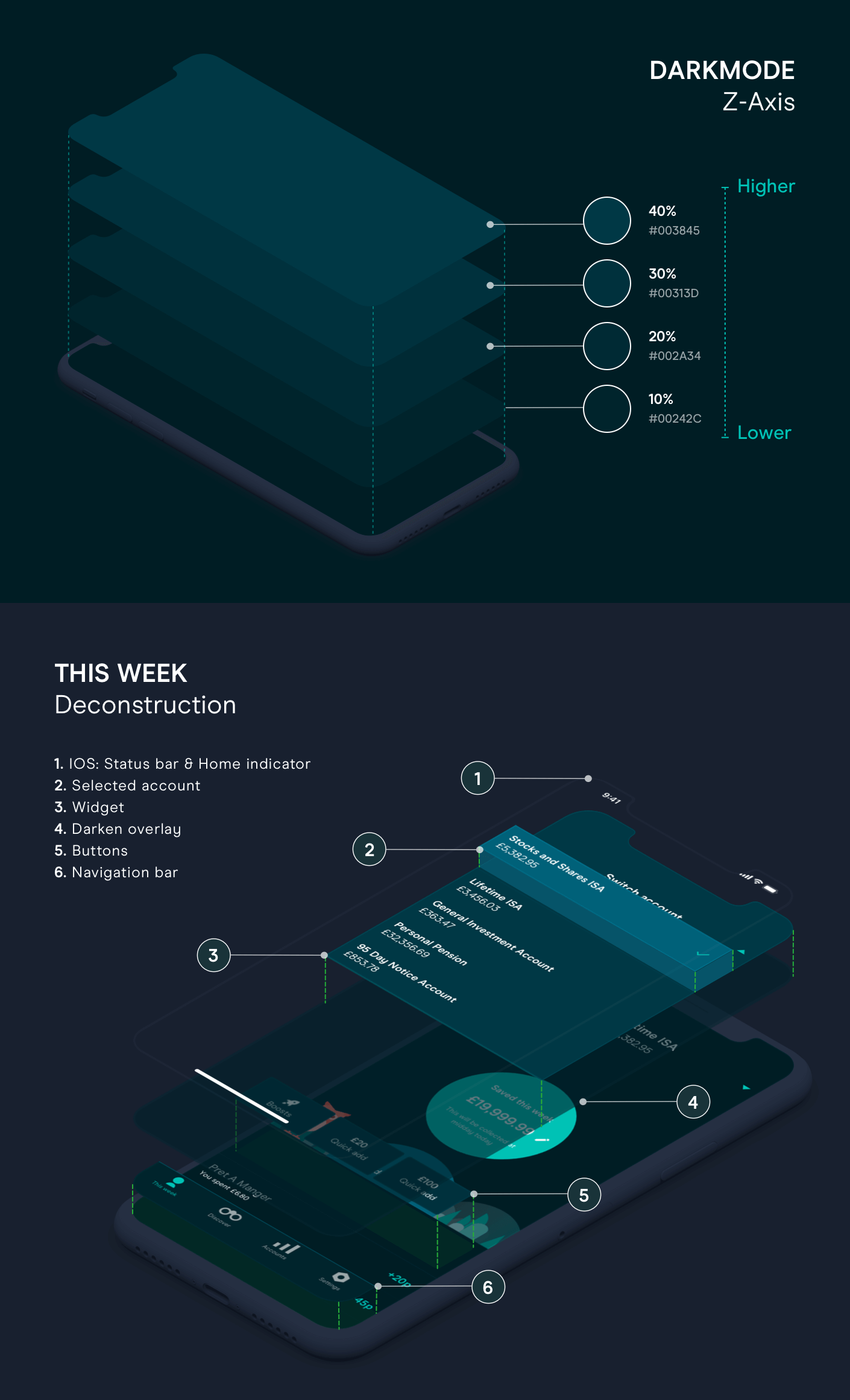
The WIP dark mode cheat sheets compiled details on what colours to switch to in dark mode and documentation on patterns based on the z-axis. This research would eventually coincide with the work on our new design system whereby for every component we had in light mode, a dark mode version should also exist. This was particularly valuable to the development team as a point of reference in seeing how our brand colours behave and look in dark mode.
Another factor that proved to be the big challenge was time or rather the lack of it. We managed to design, build, test and launch the rebranded identity across mobile and web all within five months.
Feedback
The feedback has been overwhelmingly positive since the launch of the rebrand! You can see below a few comments from our very happy new and existing users.
@moneyboxteam the home screen is easily my favourite as the round up all option makes life so easy. pic.twitter.com/MOEC2bzkHA
— Jody Randall Esq. (@jodyrandall) November 28, 2019
@moneyboxteam impressed with the new fresh look! My fav feature has stayed, the time machine! Happy to have found such a user friendly company for my first savings experience. pic.twitter.com/8waiapuJ9l
— Angela Morey (@MummaAngela) December 6, 2019
Not only you've been helping me save ma money 💰♥️ You've also been ramping up the style. Sexy new design @moneyboxteam pic.twitter.com/zPI0qNIsvi
— Gwendolyn Anslow (@AnslowGwen) November 28, 2019
Love the new @moneyboxteam look!! 😍😍😍😍 pic.twitter.com/QVcQe5O9mL
— Justin (@JustinFound) November 28, 2019
Started saving with a LISA using the @moneyboxteam app - loving the owl screen guys! #savings pic.twitter.com/QbqfFAxHLJ
— Catherine Bass (@MissBass2210) December 11, 2019
Excellent work yet again@moneyboxteam the new design is fresh and smooth, it makes checking on my effortless savings a pleasure, thank you! #fintech #openbanking pic.twitter.com/vi2gs1ZoYx
— Robin Hewitt (@rjchewitt) November 29, 2019
@moneyboxteam I had no issues with how the MoneyBox App looked before before. However I can't deny that the new look is Refreshing and Youthful with Moneybox+ getting image icons. Well done money box team!! pic.twitter.com/LoNiPiZ1VJ
— Michael Duncan (@MikeeDuncan) November 27, 2019
Been a member for just over a month now, and I’m so pleased with @moneyboxteam. The team are incredibly helpful - and the new app update looks great! pic.twitter.com/nKpznzWwFF
— Lauren Bond (@lozzobondo7) November 28, 2019
<Wow @moneyboxteam you’ve absolutely smashed it with this new design 😍❤️ pic.twitter.com/fzpH0Gkqpc
— Harry (@Harry_Talentful) November 28, 2019
@moneyboxteam I had no issues with how the MoneyBox App looked before before. However I can't deny that the new look is Refreshing and Youthful with Moneybox+ getting image icons. Well done money box team!! pic.twitter.com/LoNiPiZ1VJ
— Michael Duncan (@MikeeDuncan) November 27, 2019
@moneyboxteam absolutely love the new time machine visuals! pic.twitter.com/TJ4TOMCI9m
— SoYun A (@princess__s0yun) December 6, 2019
Absolutely loving the new look @moneyboxteam. Such an intuitive and engaging app, with a seamless experience. Also, I love the animal graphics! 👏 pic.twitter.com/BbJh7KfOiS
— Verena Feebs (@VerenaFeebs) November 28, 2019
👋 Pssstt.... if you made it to the bottom why not meet the other designers involved in the rebrand in this Moneybox blog post.