
Context
I worked at Pollinate as a Senior Product Designer on the Value Added Services (VAS) team. Our team developed and strategised on products which empowered small businesses to grow.
The 4 main offerings are:
Merchant Profile - This gave the option to our onboarded merchants to create a business listing and be added to what is essentially a yellow pages of aggregated merchants created on our platform. The profiles are then shown in our consumer app if they opt into the programme.
Offers - This primarily helped small businesses acquire new customers by enabling them to create enticing offers.
Loyalty - In parallel to offers we also allowed small businesses to create bespoke loyalty programmes to reward their returning customers.
Tyl, consumer facing app - This housed all of the above in an iOS and Android app. As a consumer, I would download the app, create an account and be presented with a marketplace full of local businesses. I can shop and save money via their offers and earn points through a host of loyalty programmes.
Kick-off
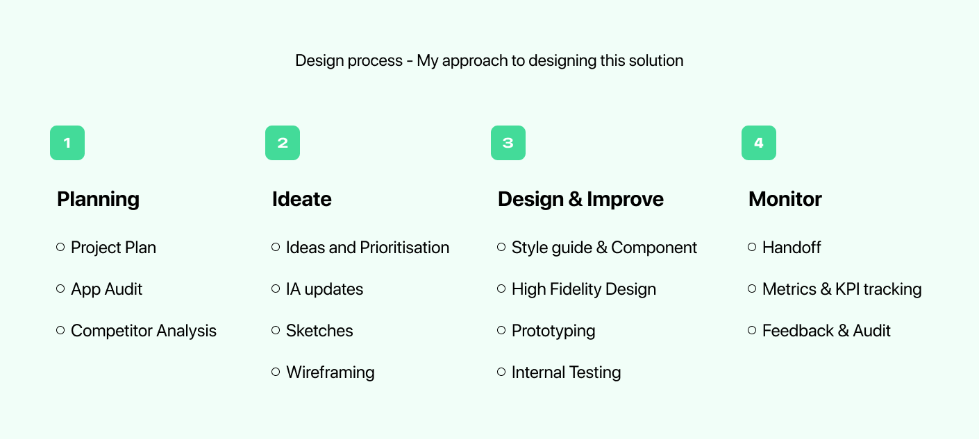
Before we started any design work, Jack (the other Senior Product Designer on the VAS team) and I drew up a rough plan on how to tackle this complex project. We worked with our product team to create a rough and dirty project plan to help keep alignment across teams with estimated timings as well as expected deliverables.
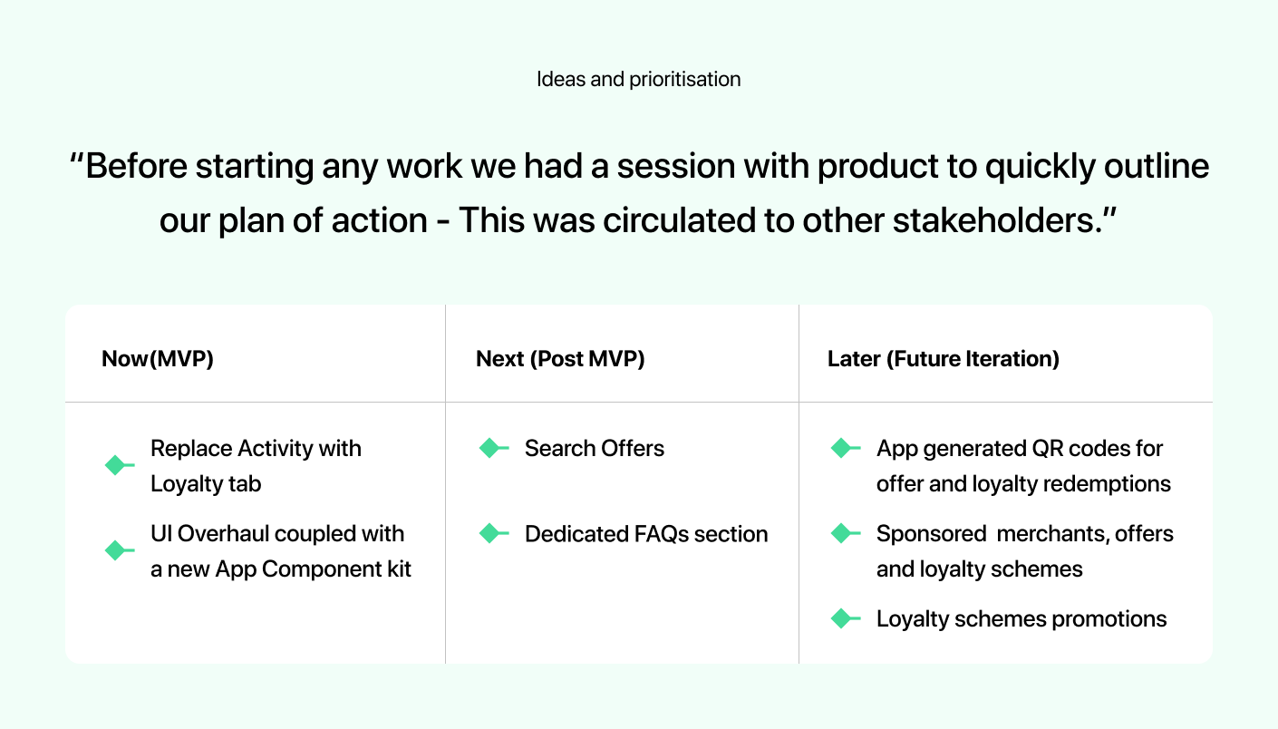
Next, we carried out an extensive audit of the existing app and noted down every improvement we wanted to make. I created a shared confluence page which we all contributed to. Ensuring we didn't overshoot our planned start date, we time-boxed this exercise. Before starting any work we had a session with product to quickly outline our plan of action - This was circulated to other stakeholders.
The collated updates in this shared document not only gave us a high-level overview of all the changes but also helped our development team to plan for resource management. The way Jack and I approached the app updates could only be described as fluid collaboration. For example, we'd be working across different sections of the app for a day or so but then we'd pass the files back and forth to one another which enabled us to design more consistently. We fed back to one another constantly ensuring that the overall UI and app experience felt and looked cohesive.
Updates & Upgrades
From the start, we knew we wanted and needed to improve almost every aspect of the app. In conjunction with the app refresh, we had also planned to create an entirely new component kit. We had planned for a few phases ahead and wanted to create an easily scaleable UI library which we could use across multiple clients. As we worked through the different sections of the app, we added components to a separate file.
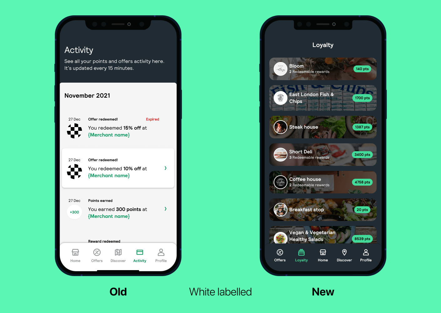
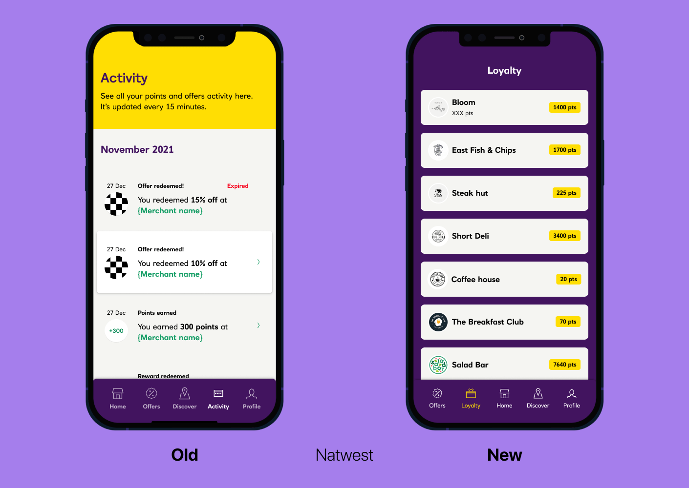
Another major update we planned to make was to replace one of the main navigation items, 'Activity' with a new section 'Loyalty'. The thought process behind this was simply that 'Activity' was agreed not to be important and needn't have a whole section dedicated to it. Instead, it could work buried in the 'Profile' section. 'Loyalty on the other hand needed to be designed from scratch and what Jack and I envisioned was a sort of Apple wallet-style design. It would accommodate the consumer's accumulated points from all the participating merchants that the consumer had shopped at. We divided sections between myself and Jack, we regularly caught up throughout the week as we had been given no time to formally do a kickoff session. All we had to work with was a soft deadline.
Use the slider below to view the before and after of the Activity vs Loyalty update - This is shown both in our White labelled and Natwest branding 👇
Review & Hand off
During the entirety of this project, we didn't encounter any major blockers or challenges other than everybody's nemesis... Time. The feedback/review processes were straightforward, we had a weekly design sync to update the team on the progress of the app updates as well as having ad-hoc meetings throughout the week with product and dev. As sections were being marked off as design complete, Jack and I would have pre-refinement sessions with the dev team to walk them through all the changes and any new interactions we'd want to implement into the app.
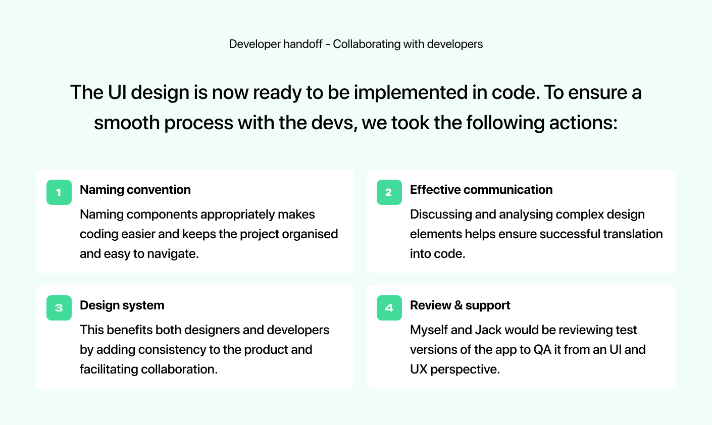
Once it came time to review what had been built by the dev team, we created a Figma file detailing any bugs or fixes we wished to be made. Taking screenshots and adding notes to specify exactly want we wanted to be changed. This was an opportunity for Jack and I to see the project from end to end and build our relationship with the development and QA teams.
With the release of the newly updated app, we have continued to note down any bugs and fixes in a file. Not everything Jack and I worked on made it into the first release, with newly introduced screen transitions being de-prioritised for later releases. There is still an ongoing effort to maintain and improve the app which involved us reviewing the app for both Android and iOS. I think our biggest takeaway from this project was our approach to developing a new component library in parallel to the app developments. It's proven to be a valuable asset that has allowed us to make app-wide updates on the fly and quickly rebrand screens for purposes like client pitch decks or presentation - The development team has also massively benefited from this.
Below is a working prototype of the first iteration Tyl Rewards app 👇
Beyond the Case study - Post release
After the successful release of the newly updated app for Natwest. I quickly got to work with a backlog of items which included some major updates to the Discovery and Offers sections.
Due to a low number of merchants who were either not fully set up on our platform with a business profile or simply not onboarded yet. There was a scarce amount of results to show when viewing the default map view of the Discovery tab to show consumers local businesses. To quickly combat this I simply switched the defaulted view to the list and not the map. The list of local merchants was ordered by proximity to the user's current location.
The next update I made was to include a search functionality for the offers tabs, this was initially discussed in the kick-off as we had previous research to say this was a highly asked-for feature. But in the end, it was agreed that the first release would only be a UI update to the app with some UX upgrades being made that were considered not as dev-heavy. I had some previous experience designing a search function and took a lot of influence from the native iOS search patterns.
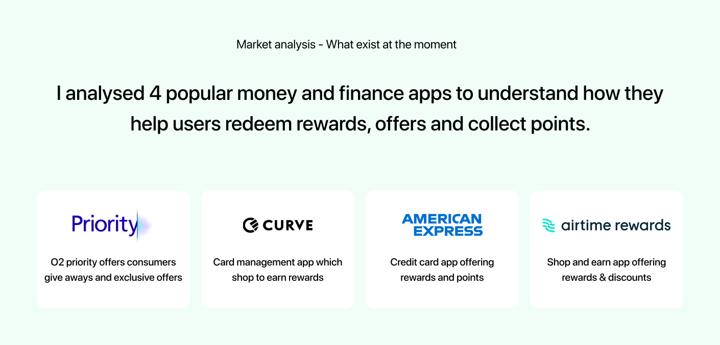
I began researching a variety of apps to see how they managed to search and how they opted to display results. Of course, this yielded more questions than answers as different apps have different user needs to solve. But having looked at various apps it did give me some inspiration and being up against time I began exploring 2 options: Simple vs complex, I asked what could we achieve now and what could we potentially strive for in the next iterations.
Below are the two options with version A showing the search functionality in an alphabetically ordered list of merchants - vs version B which hosts different actionable paths a user could take to reach their goal.
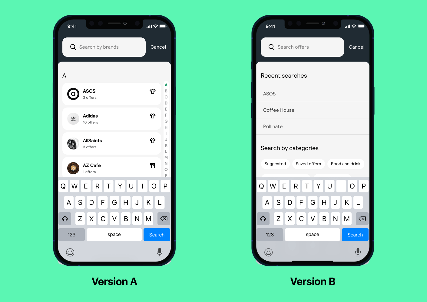
Version A is a more simplistic approach taking the iOS contact list and repurposing it for a user to search a list of merchants by their names. I especially liked the quick scrub which allowed the user to quickly start looking for a merchant which started with the desired letter. As well as the quick scrub, you could type in the search box to refine your search much quicker.
Version B on the other hand shows the user’s recent search (Hidden on first use) and categories. I hypothesised that the users would have more reason or were more likely to explore the many different offers that they may or may not necessarily go for when shown this option.
We took both versions forward for a round of unmoderated testing to gather some insight into whether my assumption was true or not. This took just under a week to carry out and it yielded surprising results. It turned out that version A was most preferred but because it felt a lot more natural to explore visually people understood the context of the screen almost immediately and some testers referenced the iOS contact list. This was great to read, however, version B also gathered some interesting feedback in that the added ability to filter offers in the context of a search function would be very useful for them quickly narrow down to a specific offer category they were interested in.
With this new information, I continued to refine the search function which led me to a hybrid design of the two. This encompassed version A with the added ability to filter a search to a specific category/categories.
Below is the final prototype for the search function that I worked on 👇
Thank you for taking the time to read through this case study ♥️ - You can view the live app on the Apple app store here.